Motion graphics: designer Ruslan Khasanov transforms light beams and liquid into stunning typefaces
How to make innovative new typefaces from sunlight and spilt ink
7 February 2013
Text
Dmitry Bezuglov
Creating typefaces is normally a rigorously logical process for designers in which they work through the rules for a new set of letterforms with painstaking precision. But Yekaterinburg-based designer Ruslan Khasanov prefers to put his faith in serendipity when it comes to building fonts.
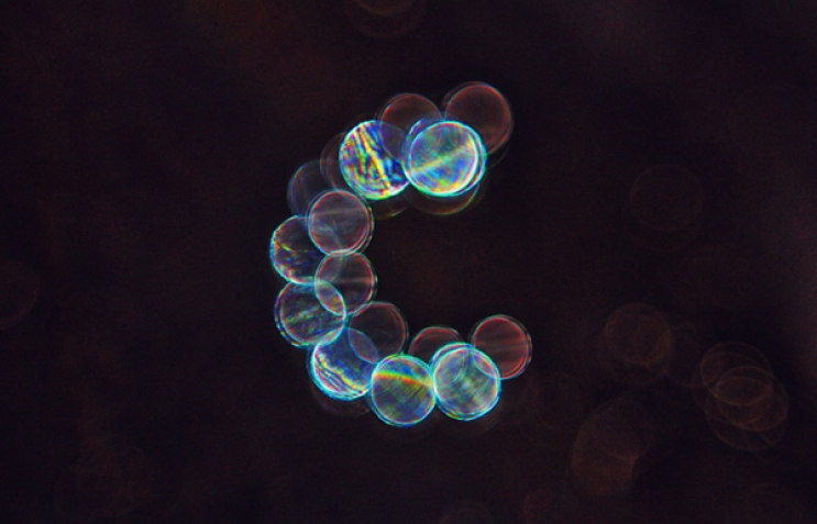
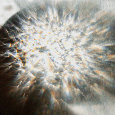
One evening in 2011, Khasanov was cleaning an ink brush and painting letterforms directly onto the porcelain sink as he went. Noticing how the letters held their shape with a brief, tremulous grace before dissolving, he started to photograph the results. He ended up shooting some 500 images for each letter over the next four days as he experimented with shape and form. By the end, and with a few enhancements in Photoshop, he had created a new typeface called Au Revoir, a celebration and a mourning for the evanescence of moving liquid. Khasanov’s further experiments with what he calls liquid calligraphy have turned him into a celebrated figure, with profiles of his work in international media such as Wired and Fast Co.Design.

Khasanov stands apart from the city’s other graphic designers in more ways than one. While his designs have won him international clients in the US, Europe and Australia, he has received very little attention in his hometown, where his aesthetic is not to local tastes. This suits him just fine. Foreign clients, he says, provide clearer briefs and crucially, pay on time. In conversation Khasanov is aloof, his answers brief. Mirroring this reticence is his physical appearance and demeanour: his blazer is buttoned all the way up to his neck and he frequently plays with his coffee cup while staring into the distance. Khasanov tends to keep to himself, rarely attending social events or public lectures. He says he’s happiest when he’s working from home where he wanders around, talking through his ideas out loud. Notes, sketches, papers and books are scattered everywhere. “Movement helps me concentrate,” he explains. “That’s the working method which helps me feel comfortable and confident so I don’t even think about going to communal workspaces.”
Khasanov is the stereotype of the reclusive artist, who sequestered in his studio, prefers to work in isolation. This preference for solitude is not helped by the fact that he works with clients in different time zones. Work and communication with clients mainly takes place at night, he says. Inspiration for his most artistic designs such as Au Revoir comes when he hits a creative brick wall with one of his commissions. “In order to refresh my mind I start doing my own projects.”
Despite being fascinated by impermanence, his ambition is to find success in a much more fixed medium by emulating a particular design hero of his. “Sometimes when sitting in front of the screen I think of William Morris,” he says. “I’d love see some of my own works as a wallpaper one day. Only if the results are as outstanding as his of course.”