Rediscover the Siberian city of Irkutsk with this bright visual rebrand
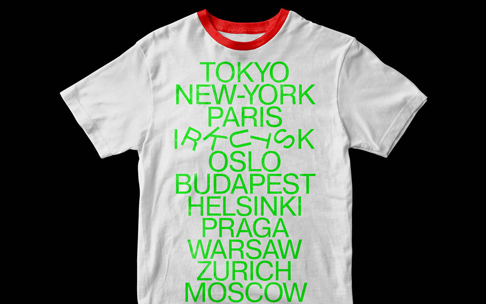
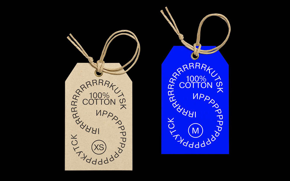
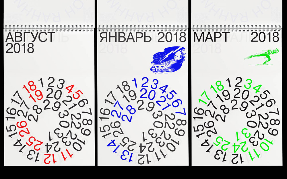
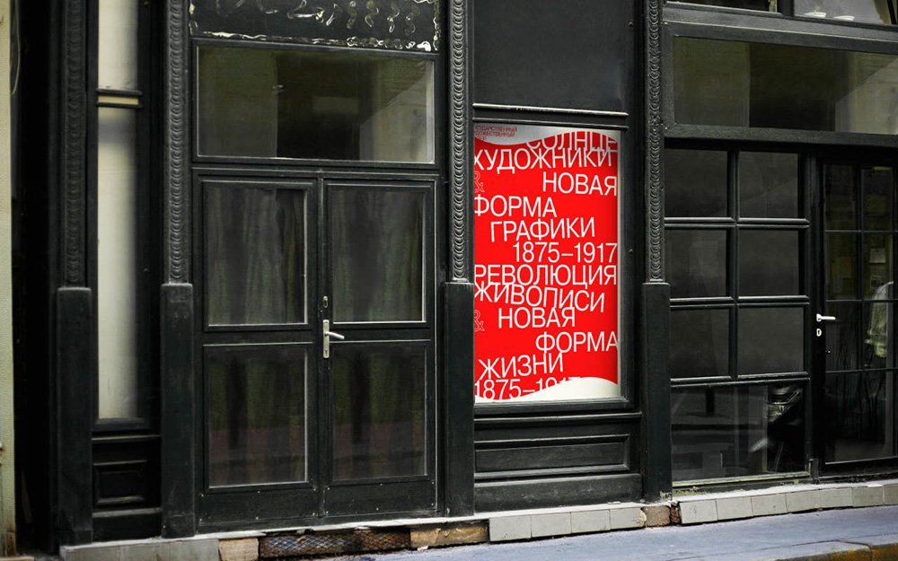
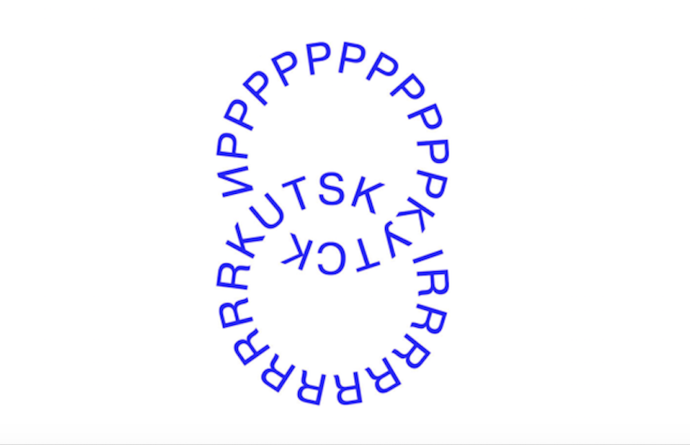
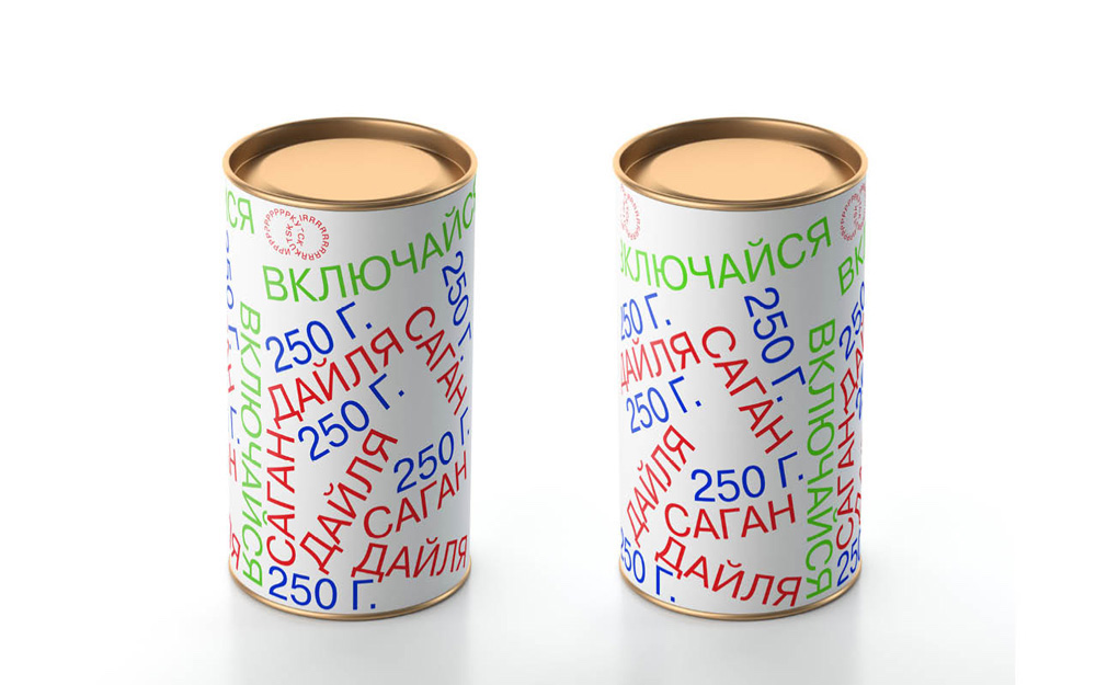
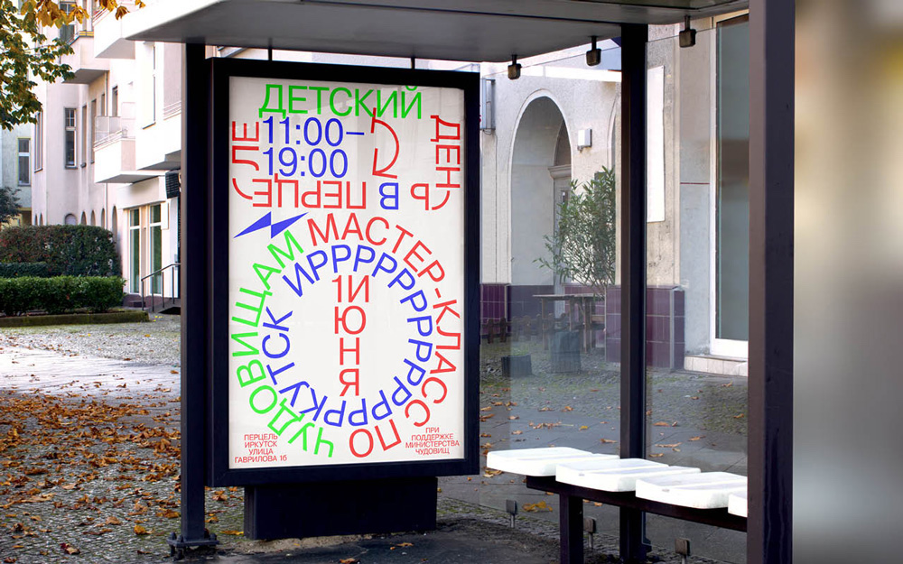
With its eye-searing colour scheme and chaotic clusters of letters, the latest visual rebrand for the Russian city of Irkutsk explodes across posters, clothes, labels and screens.
Home to a population of approximately 620,000 people, city officials hope that the new designs will help the city make a mark in the vast expanses of Siberia, hopefully bringing tourists from nearby Baikal.
“Irkutsk’s visual style is spontaneous and liberating,” says Natasha Grand, co-founder of INSTID, the company behind the rebrand. The firm has already created identities for a number of Russian regions, including Tatarstan, Lipetsk and Bashkortostan. “It aims to be powerful and emotionally charged enough to attract attention anywhere it’s applied and give people the energy to make the trip to Irkutsk.”
Grand says that the visuals channel the locals’ rebelliousness and persistence in the face of the city’s brutal winters. As well as attracting outsiders, the new visual style will appear across the city — across public spaces and promotions for music, festivals and events — to cement a bright new city image and spark local pride in an isolated and often-challenging region.
“The idea behind the brand is one of rebellion, of pushing the boundaries and challenging yourself,” says Grand, who spent time in the city carrying out interviews and meeting local people. “This is the way of life in Irkutsk. The brand manifesto and the visual style are intended to energise, activate people, give them the impetus to accomplish difficult tasks: be it making the journey to this far-off city, or invigorating city culture and life itself. This is not a cosy or comfortable visual style. Something like that would not be true to Irkutsk.”
