Andrzej Klimowski: the master of the Polish Poster School on his dark and lurid vision of cinema
Unlike the clinical and pristine aesthetic of Hollywood posters, Andrzej Klimowski’s work is characterised by bold, block colours and allusive, metaphorical shapes. He continues the beguiling legacy of the Polish School of Posters with his latest book
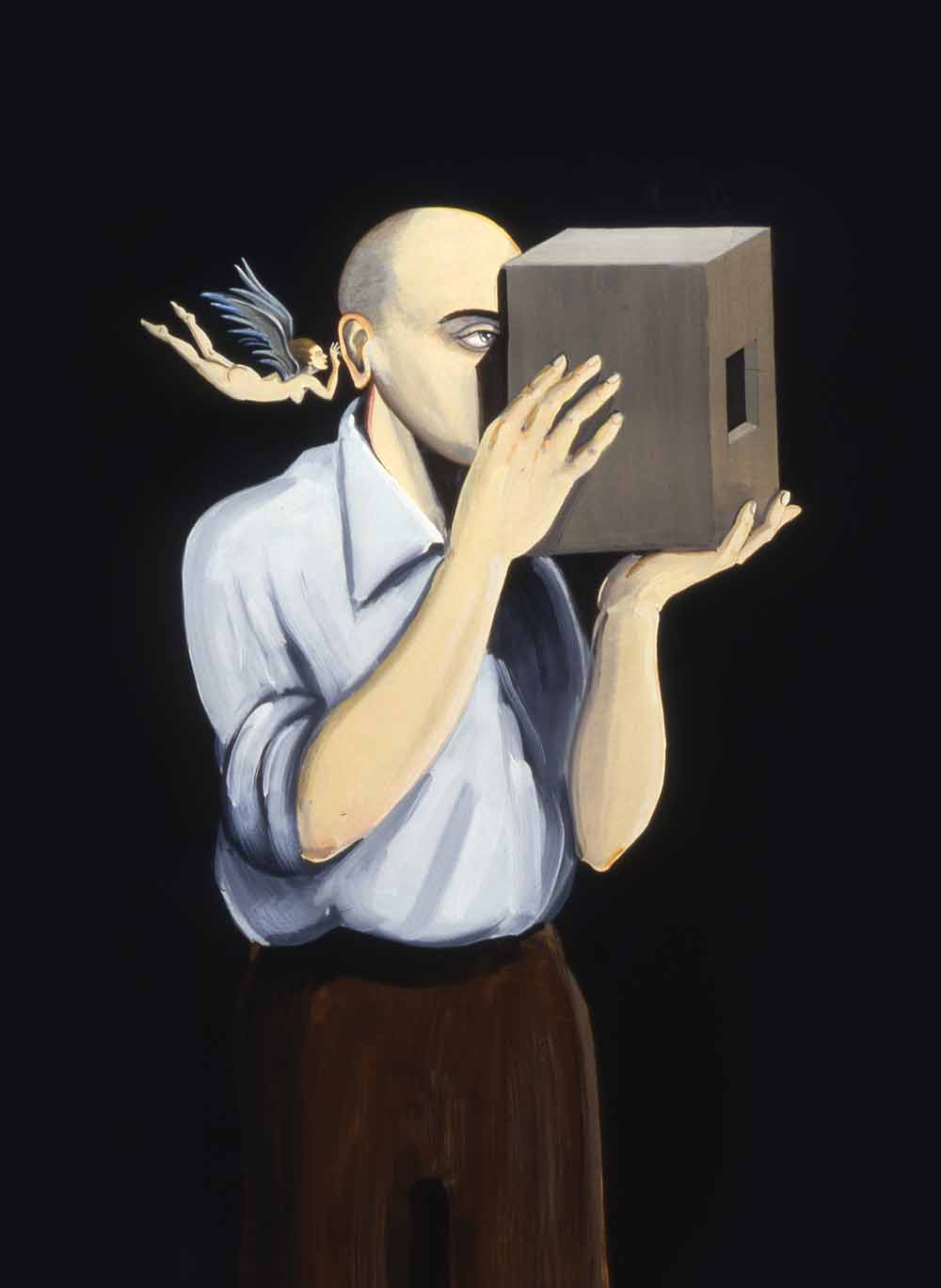
Film is always about the eye, explains iconic Polish poster designer Andrzej Klimowski. On a table at his side is a section of his 1983 work, Synapse — a double portrait of the artist and his stage designer wife, Danusia Schejbal. Their faces are obscured by magnified, collaged eyes that have been transplanted, offset, upon their skin. The effect is mildly unsettling — a reminder that cinema is ultimately a kind of beautiful voyeurism.
Posters were not so much PR tools as creative ligaments which extended the work of the film itself
Klimowski is speaking to a room of filmmakers and designers — notebooks open — who have come here to learn from one of the pioneers of post-war Polish poster design. We’ll finish the day coated in tacky smears of glue, black ink, and paper shavings. For the Polish school of posters — of which Klimowski was a leading member — the process of physical making, the construction through paper and materials, is absolutely central.
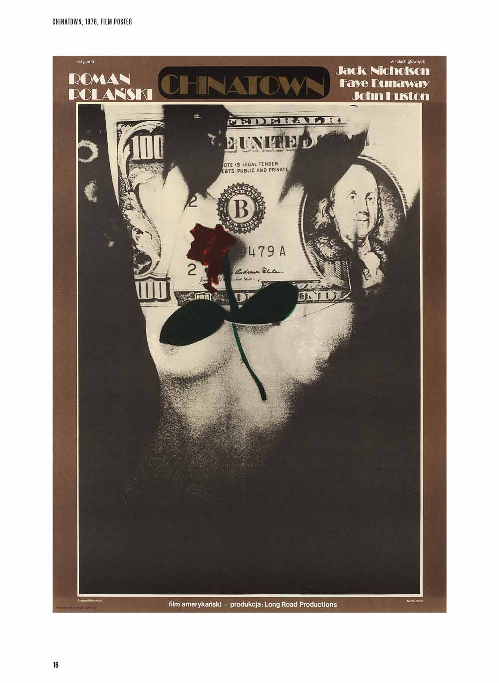
Such unexpected eyes dominate the work of the London-born, Warsaw-educated artist, whose creations have been gathered in a new poster book from SelfMadeHero, collectively embodying the distinctive style and aesthetics of Polish poster design that emerged during the 1960s and 70s — making use of bold, block colours and allusive, metaphorical shapes brought about with linocut and photomontage. Klimowski was once described by playwright Harold Pinter as “leading the field by a very long furlong, out on his own, making his own weather.” It’s not really an understatement; his images are luridly unique.
The Polish School was centred around a group of artists and designers at the Warsaw Academy of Fine Arts, where many of the founders of the movement taught during the 50s, 60s and 70s. As Klimowski puts it, “After Stalin’s death [in 1953], the officially imposed Socialist Realist style was replaced by free expression. There was no market economy, so there was no need to promote products to consume — but rather to educate and enlighten.” It was, in fact, a group of leading designers who, tasked with promoting films by the Ministry of Culture and the Arts, were given the condition that “all posters should be designed by individual artists who should have freedom of interpretation and artistic expression.” Klimowski observes that “designs [had to be] the antithesis to American posters which adhered to strict commercial criteria dictated by film producers and moguls.” The Polish Poster School, Klimowski points out, was a term “invented by foreign critics,” but it “became a phenomenon.”
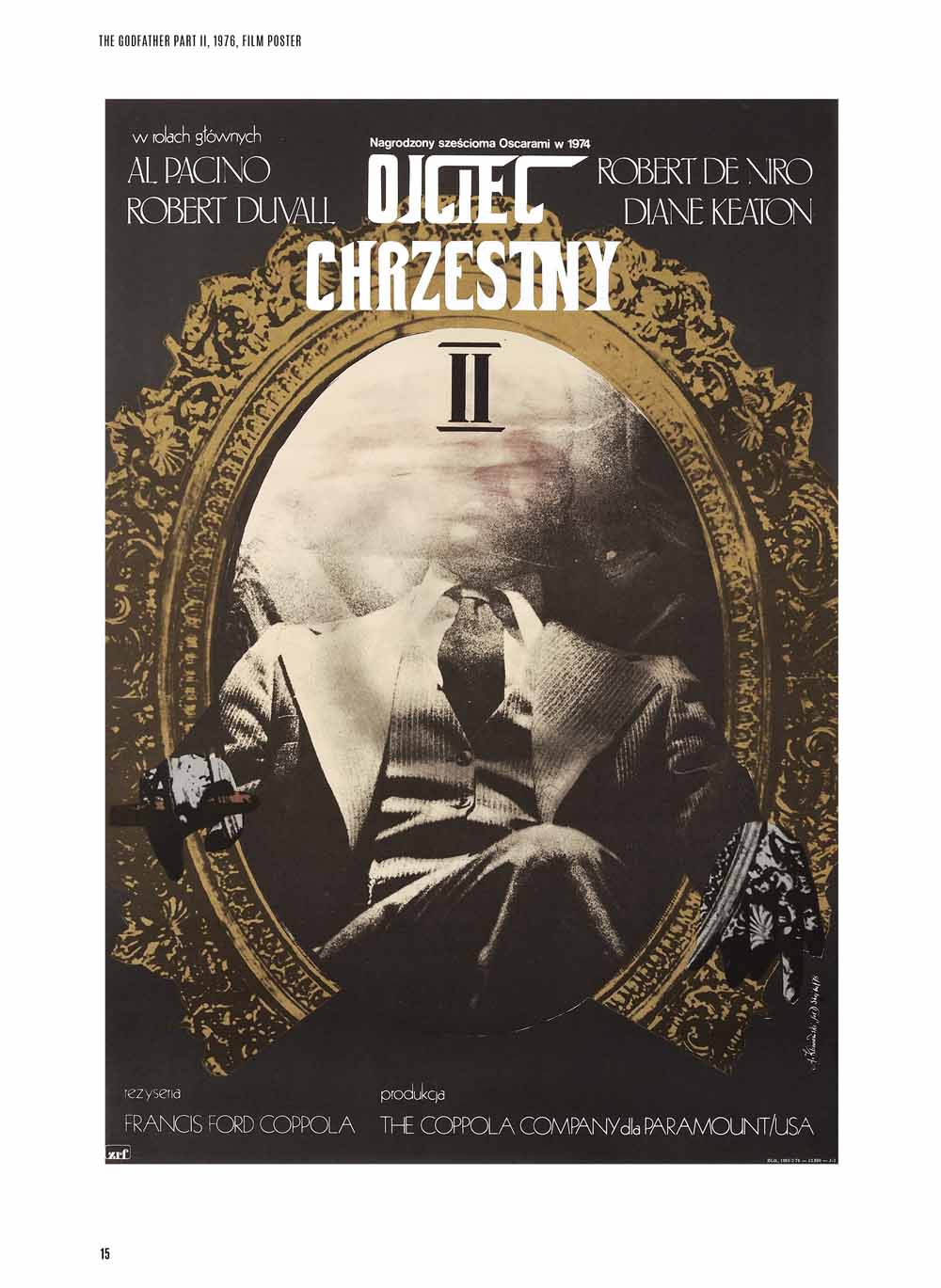
We’re used to modern poster art as a smoothly realist montage — direct and asinine; the disembodied heads of actors stacked in order of their cultural capital, something close to a bloodless totem. Eschewing this more clinical approach, Klimowski’s work is playful and allusive; a metaphorical structure dragged from the heart of film itself. David Crowley, the academic who wrote the introduction to Klimowski’s book, attributes at least an element of this style to Polish artists working in the dark, many of whom would not see advance copies of films before making the posters. Instead, they had to hypnotise the artwork into life, working off limited treatments, titles, stills, and themes. As Klimowski himself puts it, “I often come up with ideas which are visual metaphors or symbols,” based on what “best corresponds to the atmosphere of the film.” These archetypal symbols — eyes, hands, exposed torsos, angels and demons — pile thuggishly onto the page.
There are times when filmmakers have needed to shoot night scenes during the day, falsifying the darkness. “The effect is never fully convincing,” muses Klimowski during an email exchange, “but it is mysterious. I am fascinated by this ambiguity.” ‘Mysterious ambiguity’ is a fair assessment of the work produced by the School of Polish Posters, which saw an explosion at a time when the political restrictions of the post-war years began to fall away. During his university education, Klimowski helped to make a film on Polish designer Roman Cieslewicz, who played a major influence on the young artist; the elder creator’s vision of eerie, psychedelic faces and roughly montaged photos reveal the strong symbolic urge of this nascent movement, of which the young artist would become a leading light.
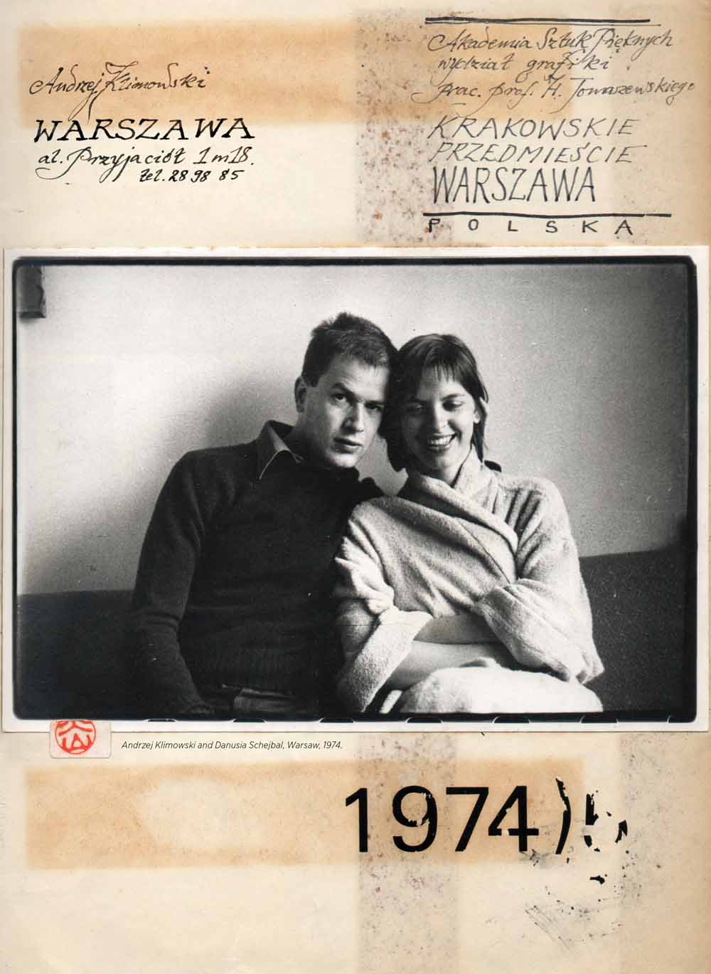
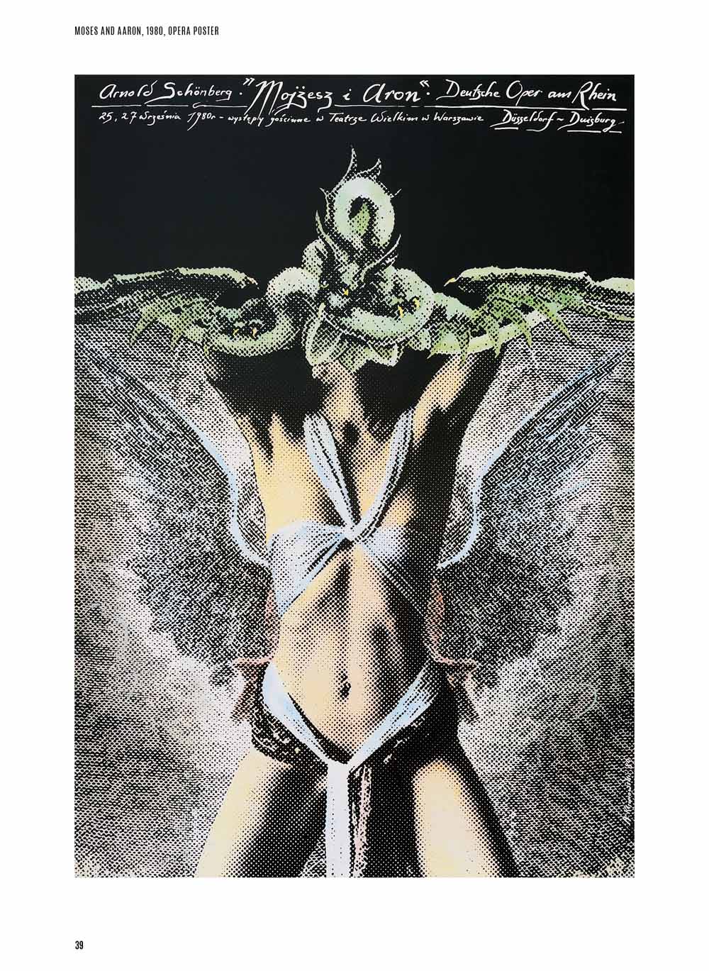
Klimowski, who studied in Warsaw during the 1970s, was born in London to Polish parents. Alongside Schejbal, he left the UK and jumped headfirst into a country experiencing both food shortages and Kremlin control. As he has acknowledged, shortages — even for basic creative materials — made the environment harsh but energetic. At the same time, the country treated its artists comfortably. Klimowski arrived at a time when Warsaw and its creative industries were flexing their collective muscles, with the film poster becoming a standout artefact of these resurgent energies. Schejbal would often appear in his posters, such as the winged serpent of his work for the Arnold Schoenberg opera Moses und Aron in 1980. Raw sexuality and monstrous transformation are sutured together on the page — an evocative and pagan summoning in paint and paper.
Seeing is believing. Take Klimowski’s brooding poster for Russian auteur Andrei Tarkovsky’s Andrei Rublev, which features the eponymous protagonist bearing a harsh, geometric cross upon his shoulder — literally slicing across his face. The eyes have been replaced with an abstracted collage of “other eyes”, lending the figure a ghoulish and ultimately not-living gaze. “Collage or photomontage,” Klimowski says, “suits film posters as they share a common form — the photographic image. It is also a way of creating a visual shock.”
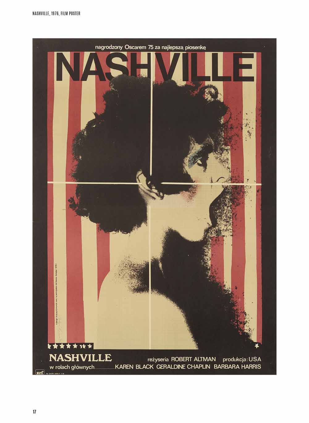
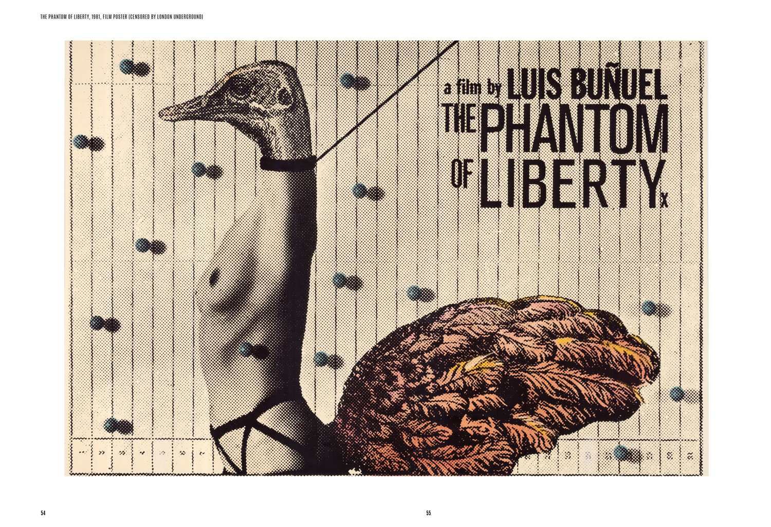
Bodies — disarrayed, and only partially human — become a site of imaginative play. The poster for Luis Buñuel’s The Phantom of Liberty depicts a woman’s body with the head and tail feathers of a bird, while Robert Altman’s Nashville sees swarms of black, spattered gore spilling from the open mouth of a roaring human head. The American flag, in wavering red and white, slides beneath this image, more like a circus tent than a national symbol. “I like black,” explains the designer, noting that the baroque plays an important role in his work, “which could be related to my Catholic and Polish background where the image’s power to permeate the senses and the soul is paramount.” Tactile material is favoured over the purely conceptual.
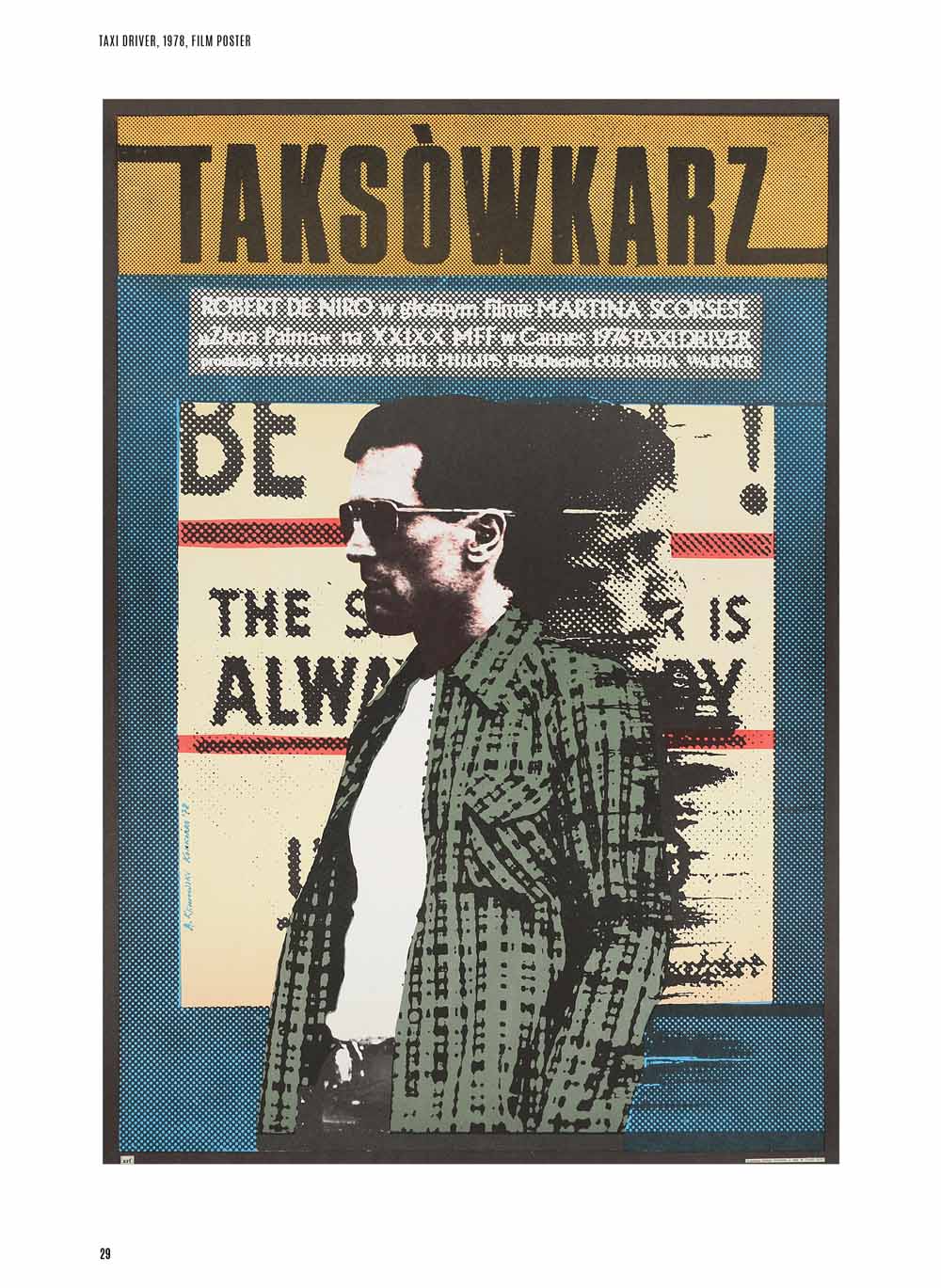
The posters thrill and buzz with the received history of the country of Klimowski’s heritage; torn between invasion and slaughter, God and the Commissar. Mystical, mythical figures loom and rise throughout their imagery, a haunting and nightmarish compendium. What emerges is a grimoire of nightmares and demons, set to films as diverse as Martin Scorsese’s Taxi Driver and Jim Jarmusch’s Mystery Train. “I am open to the liberating qualities that accident and improvisation can offer,” the image-maker explains, where “improvisation can make designs alive and vital and not clinical.”
By the time Klimowski arrived in Warsaw in the 1970s, the industry had given birth to a recognisable approach. Gaunt, bold, bloody and blocky, the posters were not so much PR tools as creative ligaments which extended the work of the film itself. Dripping in symbolism, works by artists such as Mieczyslaw Gorowski are lumpen, dark spaces that use doubling and muddy palettes to evoke a sense of the deranged and the obscure. Similar, but different, is the work of Jan Lenica, whose work is formed of bright swathes of primary colours textured in waving layers. Pop art, folkloric stylings, paint and collage were pulled and summoned into the flat plane of the works. As much as the School is referred to as a single unit, and remains instantly recognizable as a genre, no two posters look alike. This reflects Klimowski’s desire not to repeat himself, not to fall foul of mannerism.
During the workshop, I (gently) held the draft version of Klimowski’s poster for Aleksei German’s Hard to be a God. It is both minimal and eruptive; images ripped from historical engravings are layered into a brazen, knocked-together face, its right eye peering off into an impossible angle. While the poster tells us nothing directly about the film, it says everything about German’s visceral directorial style — the grey slop, blood, earth and mire that gushes and overwhelms his camera. The cutout images are fixed, overlapping into place. They literally rise from the flat page. The image speaks directly to the film.
Far away from mud and gore, Klimowski observes that “Warsaw in the 1970s was an artistic paradise for me and my wife,” where “the artistic community was one large family, and there was much cross-over of artistic disciplines, a healthy porosity.” During this time, Klimowski produced a significant amount of work for the publisher Czytelnik, who had their own canteen in the basement of their building. “We used to eat there and were able to meet many of Warsaw’s leading writers, filmmakers, theatre directors, artists, designers, actors and poets.” You can picture (and hear) the canteen in your mind, laughter and feverish discussion taking place over plates of pierogi and steaming goulash. “They lived for their art,” Klimowski explains, “and this enthusiasm was contagious.”
Over time in Poland, however, the power balance shifted. “Eventually,” Klimowski explains, “social injustices and inequalities came to the fore. Writers and artists were arrested for supporting workers and students. A new system was in the offing; the Polish Poster was slowly disappearing.” While a freer political climate gave life to the School, it was also subject to the whims and political prerogatives of that climate.
Today, digital image generation has, as Klimowski puts it, favoured “clinical, pristine composition at the expense of expression and tactility.” The hand “no longer plays an important role.” And yet, the iconic designer remains excited by the work of his students, who combine analogue and digital processes, working against the film industry’s more ‘anodyne’ works; its bland totemism.
The Polish School of Posters celebrated the maker’s hand at work, the tactile and the painterly. Its legacy is immense, and runs against the grain of what we expect a film or opera poster to do. Deciding to obscure leading actor Monica Vitti’s face in his poster for Michelangelo Antonioni’s The Mystery of Oberwald in 1981, for isntance, was a decision that would be almost incomprehensible today, when star power is favoured over the conveying of mood. The film was innovative, and the poster entered into a strange, doleful confessional with it, goading viewers who were caught in its gaze. Klimowski, who continues to teach in London at the Royal College of Art, is emphatic on this point: “The viewer must not be allowed to be neutral.”
With thanks to David Crowley and Judson Hamilton
Text: Owen Vince
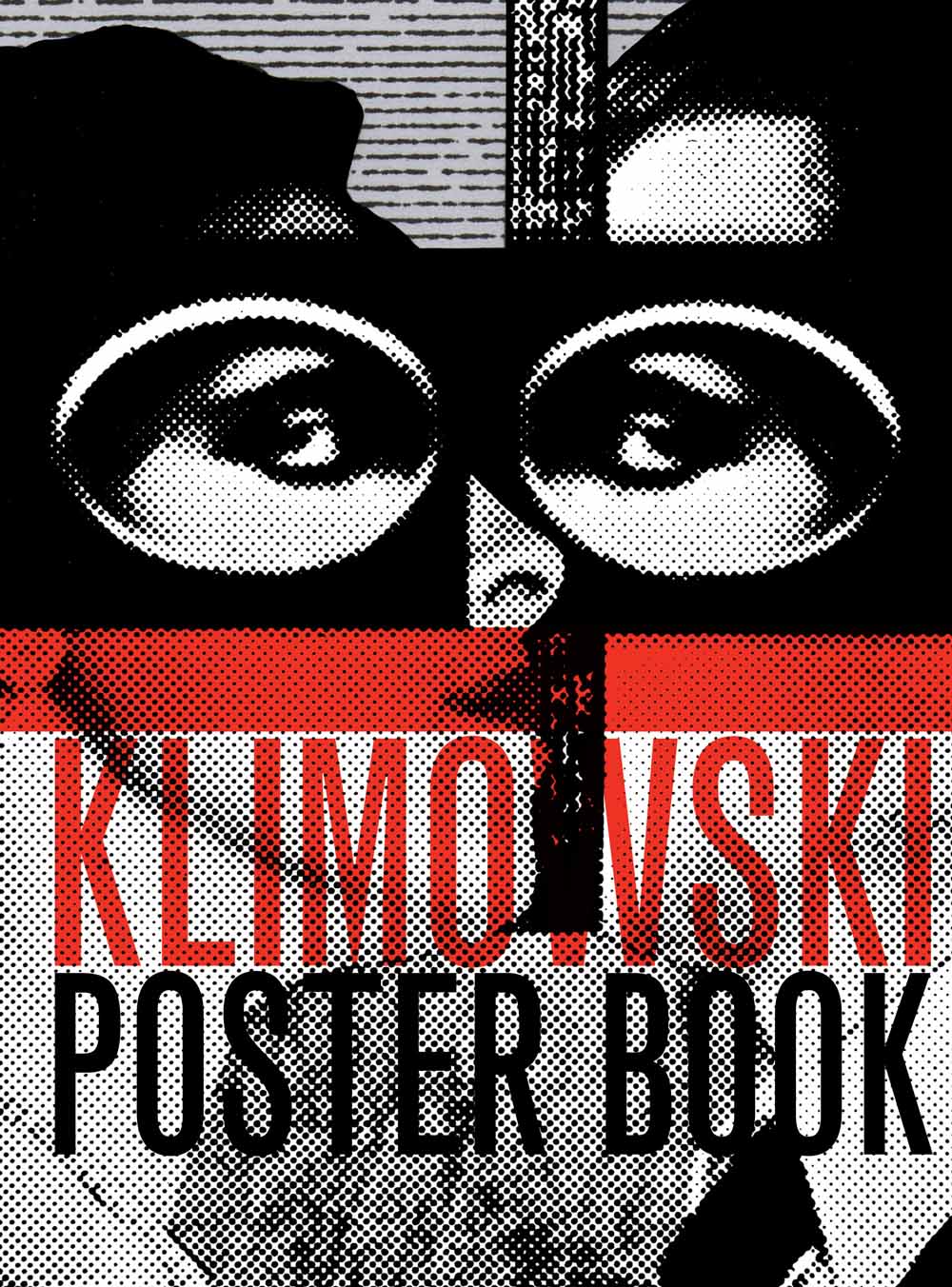
Klimowski Poster Book by Andrezj Klimowski is published by SelfMadeHero and available now.
